Feature: 5 Annoying Things About The Zenith Chronomaster Sport
It’s new, it’s here and everyone’s talking about it: it’s the Zenith Chronomaster Sport, and we think it’s great. So, let’s go pick some holes!
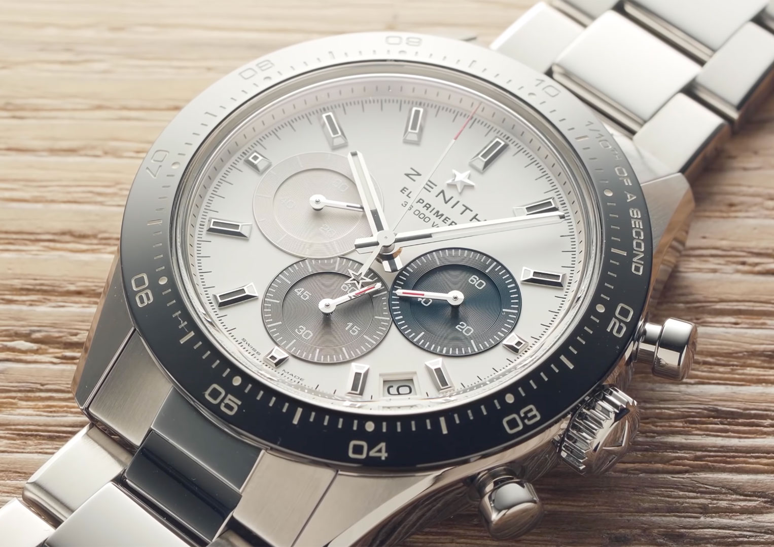
The Bezel Text
If you’re familiar with the history of Zenith’s El Primero calibre, you’ll know it was not only one of the first chronographs that could wind itself, but also the first that had a high beat as well. That means, per second, it ticks ten times, twice more per second than your typical watch. So what, right? Not like you can see something happening eight or ten times per second to distinguish the difference.
The very fact that humans aren’t particularly good at keeping accurate time beyond knowing it’s roughly midday and close to lunch is why the chronograph was invented in the first place. And, since humans are prone to gambling, it won’t surprise you to learn that one of the very first chronograph mechanisms was built to determine whose horse had won.

And when those differences are split by the merest of moments, well—that’s when you need to slice up a second into more digestible chunks. With our metric system, the next unit down from seconds is the tenth of a second, and—clue’s in the name—there are ten of them per second. I’m sure you can see where this going. It’s very hard to measure a tenth of a second with a watch that only ticks every eighth.
Enter Zenith’s El Primero, which beats 36,000 times per hour—as it says discreetly on the dial—which is, of course, ten times per second—as it says not so discreetly on the bezel. Now, fine, they want to show off that their chronograph does what very few others can, and I get that, but when the massive great line of text takes up a sixth of the available space and in doing so actually makes the instrument harder to use because it replaces one of the numbers on the scale, that’s annoying. I know it’s just the number one, which is pretty easy to remember, but it’s still annoying.
The Dial Design
When you go to design school—which I haven’t—I imagine day one of design boot camp goes a little something like this: there’s a drill instructor, but they’re wearing Yeezys, and they scream at all the new recruits until one thing and one thing alone has stuck—that design should never get in the way of its own purpose.
Take the Rolex Submariner, for example. Its dial has been designed to be eminently visible no matter the circumstance, be it light or dark, whatever orientation you can think of and in the most difficult of seeing conditions. There’s a big triangle at the top which tells you it’s the top, rectangles at the quarters and circles everywhere else. The hour hand is stubby with a big blob broken into three to keep the luminous paint stable. The minute hand is skinny and reaches all the way out so it’s usable with the bezel. It is an instrument and it has been designed to be used as an instrument.

The Zenith Chronomaster Sport, however … not so much. Now, let me caveat this by saying I really, really like the way it looks, and since I’m never likely to be needing the chronograph in any particular circumstance where I would be seriously dependant on its functionality, I can overlook its shortcomings from a practical perspective. That doesn’t stop them being annoying, however.
Here’s what I mean: when you have a device so accurate as to measure a tenth of a second, does it make sense to you to take those displays and, oh I don’t know, make them cover each other up a bit? Or, perhaps, cram them in so tight you can’t tell where one ends and the other begins? Now, I’m pretty sure the original thinking was to maximise each display, and the differing colours used to separate them visually have the happy coincidence of, in my opinion at least, looking really nice—but in terms of practical design, they are an annoying bodge to fix a problem that didn’t even need to exist in the first place.
The Date Especially
So maybe since the dial looks so good it can be forgiven its technical foibles. Okay, so maybe I’ll end up in some life-or-death situation where this statement will bite me on the behind, but I think the chances of that are pretty slim. What’s also pretty slim, annoyingly, is the gap Zenith has tried to shoehorn the date window into.
It’s a hot button topic, the date window and where it’s placed, getting under the skin of many a would-be owner whose natural desire for order and arrangement gets poked rather uncomfortably when watch manufacturers ruin a dial with a date window. Like Alfa Romeo insists on making cars that are not designed to sport a front number plate, Zenith here has given us the gift of a beautiful dial and then sent it to the intern to figure out how to tell us which part of the month we’re in.

Everything about it feels compromised. It’s trapezoidal to line up with the markers but not the text itself. The date, whichever way up it was printed on the date wheel, would be at a weird angle. The asymmetrical positioning seems based solely on the understanding that it wouldn’t really fit anywhere else and that date windows are usually on the right, no higher than the centreline.
The bigger Zenith Chronomaster does a slightly better job of not making the date look like an afterthought by squeezing it in at six o’clock, but the bezel on the Chronomaster Sport prevents that from being an option without eating into the sub-dial. I’m not sure which would be worse, that or what we’ve got. What’s annoying is that there’s even a date at all. I wonder if there’s a good use-case scenario in leaving the date off a popular chronograph watch? Hmm …
The Clasp
Before the Zenith Chronomaster Sport, I was often left bemused by angry rantings about clasps. It’s just a clasp, right? How much hatred can one person have for a securing mechanism? As long as the thing stays on it should be fine—or at least that’s how I thought before I came across the clasp on the Zenith Chronomaster Sport.
Here’s the thing though: if I had come across the clasp on the Zenith Chronomaster Sport in isolation, I probably wouldn’t have a problem with it. It’s pretty well made, feels solid—it’s just a bit tricky to open. It’s one of those ones that feels like no one at the factory ever tried opening themselves. Either that or they have a lot more calcium in their diet than I do.

This thing is a nail-killer. Breitling clasps can be a bit like that too, where for some reason the securing force exceeds the torsional limit of the average fingernail. Being that I routinely use my fingernails for finding the end of Sellotape and other such tasks, losing them all to Zenith’s medieval torture device isn’t something I’d be thrilled with. Instead, pinching the whole thing either side and pulling seems to work just as well and—more importantly—safely.
No, what’s annoying about this clasp is that it is the spitting image of the one found on the watch the Chronomaster Sport shares so much visual DNA with: the Rolex Daytona. The polished stripe down the middle, the flip lock, the lever underneath—except instead of a satisfying and non-painful sprung mechanism, you’re greeted with a malignant imitation. How the folks at Zenith could pore over the Daytona’s clasp to get it so obviously similar and then skip the whole oh-it-actually-has-to-work thing is completely beyond me.
It’s Not A Daytona
But the most annoying thing about this watch isn’t the clasp—it’s what the clasp wishes it was. Despite the shortcomings preceding, this watch is an absolute gem. It is flying off shelves the world over and rightfully so. Yet, no matter how you look at it, how you justify it, it’s impossible to get away from the elephant in the room that is the obvious resemblance to the Rolex Daytona.
And let’s say you do successfully overcome that mental hurdle. I don’t mean when you say out loud to your partner that it’s fine in an effort to trick yourself into being convinced because you can have this one now rather than waiting for what you really want—I mean properly convinced. Mind at peace and other zen things like that. Even if you are totally at one with this watch, that doesn’t mean everyone else will be. And that will be annoying.
“Nice Daytona.” Get used to hearing that. “Is that a Rolex?” You’ll be able to put up with it at first, but at some point you’ll snap. It’ll probably be when someone, usually the guy who asks questions at work that feel way too personal, asks, “Is that a real Rolex?” No, no it’s not, and it never will be. It’s a real Zenith, and that’s fantastic, because real Zeniths are fantastic, but to those who haven’t yet been initiated into the adventures of Charles Vermot, it’s a not real Rolex. “It’s a Zenith,” you’ll say. “Oh,” they’ll say. “Not a Rolex?” “No.”
Honestly, I’m really hoping the Chronomaster Sport is the turning tide a brand like Zenith really needs to get the respect it deserves. Its close ties with Rolex and indeed the revolution of the industry have earnt it a prime seat at the luxury watch table, where, right now, it doesn’t feel quite so comfortable. The watch may have its idiosyncrasies, but the overwhelming positivity really makes it a force for change that’s not just better for Zenith, but for all of us, too. Well, maybe if they get rid of the date, at least.
Looking for pre-owned Zenith Chronomaster? Click here to shop now
Looking for a pre-owned Zenith? Click here to shop now
Looking for pre-owned Zenith finance? Click here to shop now